


Ibrahim Zaki
Ibrahim Zaki is a multidisciplinary designer and calligrapher based in Dubai, with a BA in graphic design from An-Najah National University, Palestine. His work has been exhibited internationally and selected multiple times for the Hundred Best Arabic Posters initiative.
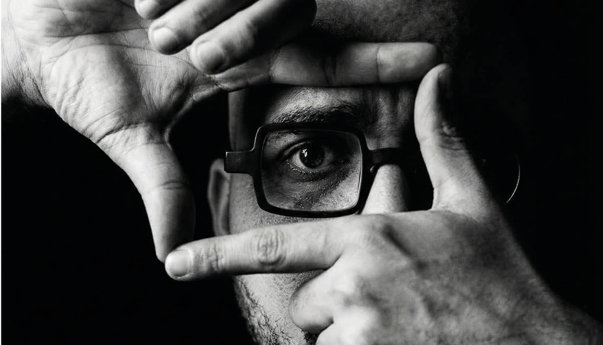
Before Ibrahim knew the word typography, he knew paint and brush on wood. His father was a sign maker, his first teacher to reveal what a letter could do even though he wasn’t a trained calligrapher: He approached Arabic script not with reverence but with the instinct of someone who needed it to work. He bent letterforms playfully, shaping them to carry a message, catch an eye. No rulebook. Only the brush, the wall, the problem. The letters became his own: informal, creative, alive.
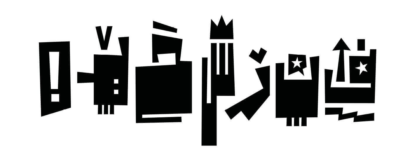
Exploring Type, Structure, and Character.
Growing up in Jenin taught Ibrahim something no classroom could. A city of land and slow seasons, its signs were unhurried, honest. The message was enough. Nothing reached for you. Then he walked through Nablus, and everything shifted. Nablus requires you to look. Dense with commerce and centuries of mercantile pride, its streets are a visual argument. Above the old soap shops, letterforms carry real craftsmanship. The calligraphy there doesn’t just identify a place; it performs one. Two cities. Two understandings of what a sign is for. Between them, a lesson that Ibrahim continues to carry: The visual language of a place mirrors its economy, its culture, its self-image. Signs are not decoration. They are documents. All of this has given him something more valuable than technique: the permission to see calligraphy as an open space, not a fixed tradition. Sometimes he presses his identity into a letterform, and what emerges is layered, almost defiant. At other times, the letter takes on volume, body, presence.
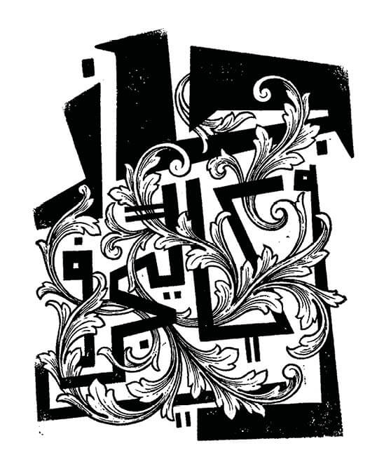
Daily Experiments in Type, Style, and Form.
Over the years, Ibrahim has collaborated with Adobe, Apple, SQUATWOLF, Ray-Ban, Samsung, Lululemon, Poison Drop, and On Shoes, alongside agencies that include Leo Burnett, Saatchi & Saatchi, Oliver Wyman, and Landor. These collaborations reflect the conviction that the Arabic letter, when allowed to breathe, carries an identity that cannot be borrowed.
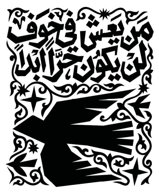
Daily Experiments in Type, Style, and Form.
One memory feels like a full circle. His father once handed Ibrahim a copy of This Week in Palestine’s January 2000 issue, its cover graced by an art installation. He held it out and said: Look how art is happening here. A wish took root. His father was the first to show him where to look.
The question Ibrahim carries through every composition, workshop, and commission is the same one his father answered daily: What must this letter say, and how must it feel? The answer is always different. The asking never stops.
